Showing posts with label maps apis. Show all posts

Thursday, 26 September 2013

Visualizing airport delay correlations with Google BigQuery and Maps API

Author PhotoBy Josh Livni, Maps Developer Relations Team

Cross-posted with the Google Geo Developers Blog

Last week Felipe and Michael from the Google Cloud Platform Developer Relations team released a video demonstrating the new Pearson correlation analysis available in Google BigQuery. Their example used more than 70 million flight records to find correlations on departure times, which could be used to predict whether your plane would be late. Specifically, you can find out which set of airports best predict your airport’s possible flight delays the following day.

As you can see from their code (watch the video for context), they’re using iPython Notebook to work with the BigQuery results, and matplotlib to get a quick visual of results. But one aspect that’s hard to see in these results is the spatial relationship of the airports. Maps to the rescue!

My goal was to create a simple visualization, where selecting any airport would highlight which airports you should look at to predict delays the next day. Using the Google Maps JavaScript API I went ahead and did just that:
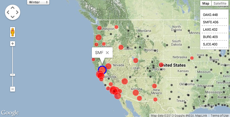


To create this map, using the same code noted above, we first created a JSON dump of the correlations on departure time for each airport to each other airport. Then, using an article on visualizing earthquakes as a template, I modified the code so that we have a simple dictionary of all airports, keyed by their airport id. Last but not least, I added a function that gets called when an airport marker is clicked in order to restyle all the other airport markers according to their correlation. This method checks the selected season (winter, for example, has different correlations than spring), and highlights correlated markers by setting the color and scale of the circle symbol.


Thanks to BigQuery, running complex correlations over billions or trillions of attributes is surprisingly easy. But don’t forget if your data does have some spatial component, a quick mapping visual can add some great context to your results.


Josh Livni works with maps at Google, where he helps developers tell compelling stories using the Google Maps APIs. As you read this, he's probably writing code, thinking about snowboarding, or both.

Posted by Scott Knaster, Editor

Friday, 20 September 2013

Fridaygram: Galapagos on Street View, insect gears, Foucault’s doodle

Author PhotoBy +Scott Knaster, Google Developers Blog Editor

Regular Fridaygram readers know that Street View goes places even if there aren’t any streets, like the Galapagos Islands. This week we launched the panoramic images collected earlier this year with the Street View Trekker, and they’re pretty cool.


As we mentioned back in May, we also used an underwater camera to collect images of marine life in the waters off the Galapagos. Between the land and the sea, we collected pictures of blue-footed boobies, Magnificent Frigatebirds, and other island creatures. These images will help with Galapagos environmental research. If you’re interested, you can read more about it.

Speaking of the wonders of nature, researchers have used high-speed video cameras to record insects with natural gears that mesh to enable movement. Scientists Malcolm Burrows and Gregory Sutton of the University of Cambridge found that young planthoppers have microscopic gear teeth that synchronize their legs when they jump. Their legs move within 30 millionths of a second of each other, ensuring that their jumping is effective. As the insects mature, they lose these baby teeth and learn to jump without them.

Finally, last Wednesday’s Google Doodle honored the birthday of legendary physicist Léon Foucault, namesake of the Foucault pendulum, which shows the effect of the Earth’s rotation. The doodle itself is a working Foucault pendulum, complete with controls to change its time and location. We hope it inspires you to do some weekend inventing and adventuring of your own.


The world keeps turning, and Fridaygram keeps publishing. Look us up for nerdy cool news right before you start your weekend. And for still more amazing Galapagos stuff, see Darwin for a Day, built by the Charles Darwin Foundation and iNaturalist using the Street View API.

Monday, 16 September 2013

Sun Surveyor shines with Street View

Author PhotoBy Monica Tran, Google Maps API Team

This week's Map of the Week post from the Geo team features Adam Ratana's Sun Surveyor app, which allows photographers, gardeners and builders to visualize sun and moon paths over locations around the world. The Sun Surveyor app has both Map and Augmented Reality views, which not only let you see the sun and moon paths over satellite imagery, but also via your phone's camera, while you're onsite at the shoot.

Visualizing the sun and moon paths in Augmented Reality and Map views

Adam's users requested the ability to visualize the sun and moon paths on top of Street View panoramas, which would give them a better IRL (in real life) approximation of lighting for their photo shoots. When Street View launched in the Google Maps SDK for iOS, Adam did just that, bringing the feature to life for users in just a weekend.

Visualizing sun and moon paths on top of Manhattanhenge in Sun Surveyor

We were impressed by his clever use of overlays to mimic the sun and moon path polylines that you see in the app. In his three-step tutorial on the Geo Developers Blog, Adam walks us through his approach to implementing overlays in Street View by:
  1. Creating an overlay on top of the panorama upon which to draw the items
  2. Synchronizing the positions of the overlay items with the panorama as it moves
  3. Determining which data are visible and where on the screen to draw them
Check out Adam's post on the Geo Developers Blog for code snippets and details on the sample project.

And in the meantime, enjoy following the sun and moon to distant locations in Sun Surveyor.

Adéle Penguin Rookery, Antarctica (from the Antarctica Collection)

Hanauma Bay, Hawaii (from the Google Maps Ocean project)


Norway

Stonehenge (from the UNESCO World Heritage Collection)


Adam Ratana is a Carnegie Mellon University graduate living in, and loving, Pittsburgh, PA. He produces dance music as a member of Pittsburgh Track Authority, enjoys photography, traveling with his wife, and writing fun software in his free time. Adam also enjoys attending the Pittsburgh Cocoaheads chapter meetings.


Sun Surveyor visualizes the sun and moon in a variety of ways for photographers, filmmakers, solar industry professionals, architects, homebuyers, gardeners, and anyone needing to predict or understand the movement of the sun and moon.

Monica Tran joins us from our Google Maps API team in Sydney, where she helps developers tell stories and build businesses with maps.

Posted by Scott Knaster, Editor